Overview
OnchainKit provides flexible appearance control through two main features:mode and theme.
- Mode: Controls the light/dark appearance with
auto,light, ordarkoptions - Theme: Sets the overall styling including colors, fonts, and border radius
OnchainKitProvider to create a customized interface that matches your application’s design.
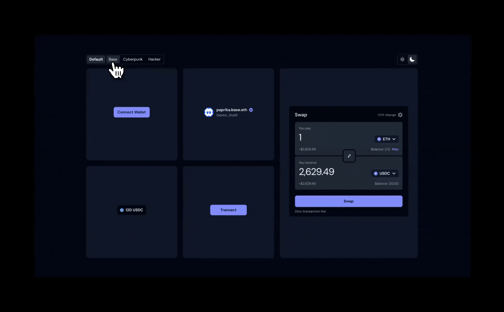
Built-in Themes
OnchainKit includes several built-in themes. Set the theme via theOnchainKitProvider using config.appearance.theme:
default: Multi-mode theme with light and dark variantsbase: Base brand colors, available in light and dark modescyberpunk: Dark-only theme with fuchsia accents and Oxanium fonthacker: Monospace theme with zinc colors and Noto Sans Mono font
default theme is used.
Mode
Control the color scheme by setting theconfig.appearance.mode property:
auto: Automatically switches between light and dark based on system preference (default)light: Forces light mode for all componentsdark: Forces dark mode for all components
cyberpunk and hacker ignore the mode setting.
CSS Overrides
Fine-tune specific aspects of an existing theme by overriding CSS variables.Custom Theme
Create a completely custom theme with full control over colors, fonts, and styling.Custom Theme Setup
Define your custom theme using CSS variables. Theme classes should include-light and -dark suffixes for multi-mode support: